survey |> dim()[1] 264071 16R/ggplotSample report
R-based processImagine spending less time wrestling with spreadsheets and more time delivering insights that drive real decisions.
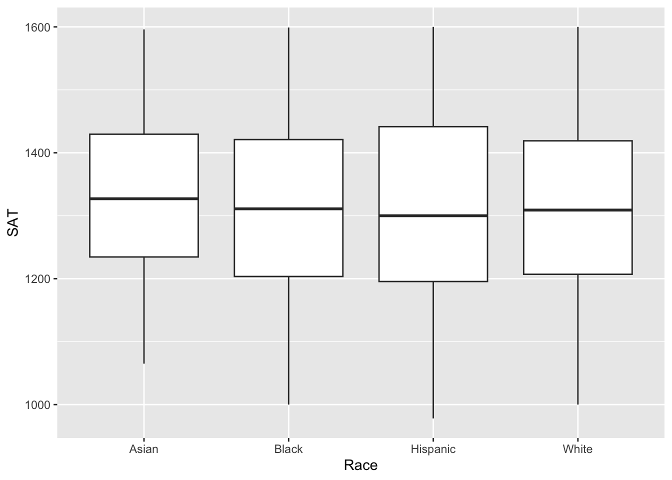
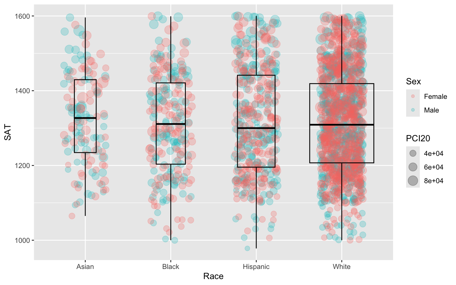
ggplot graphicsggplot allows you to create a wide variety of plots (e.g., faceted plots, histograms, boxplots, heatmaps) beyond Excel’s standard offerings, and it’s easy to customize virtually every aspect of the plot.
With ggplot, you define each part of the visualization explicitly in code, making the process transparent, reproducible, and auditable, unlike Excel, where chart creation involves manual steps.
Once a ggplot script is created, it can be reused with new data effortlessly, while Excel requires redoing many manual steps every time data changes.
ggplot integrates with R, allowing automated data manipulation, visualization, and report generation (e.g., within scripts or Quarto documents). Excel relies on more manual input for generating charts, which is time-consuming and prone to errors.
ggplot offers detailed aesthetic control over themes, colors, and styling, ensuring professional-quality visualizations. Excel’s design options, while functional, are more limited and harder to fine-tune.
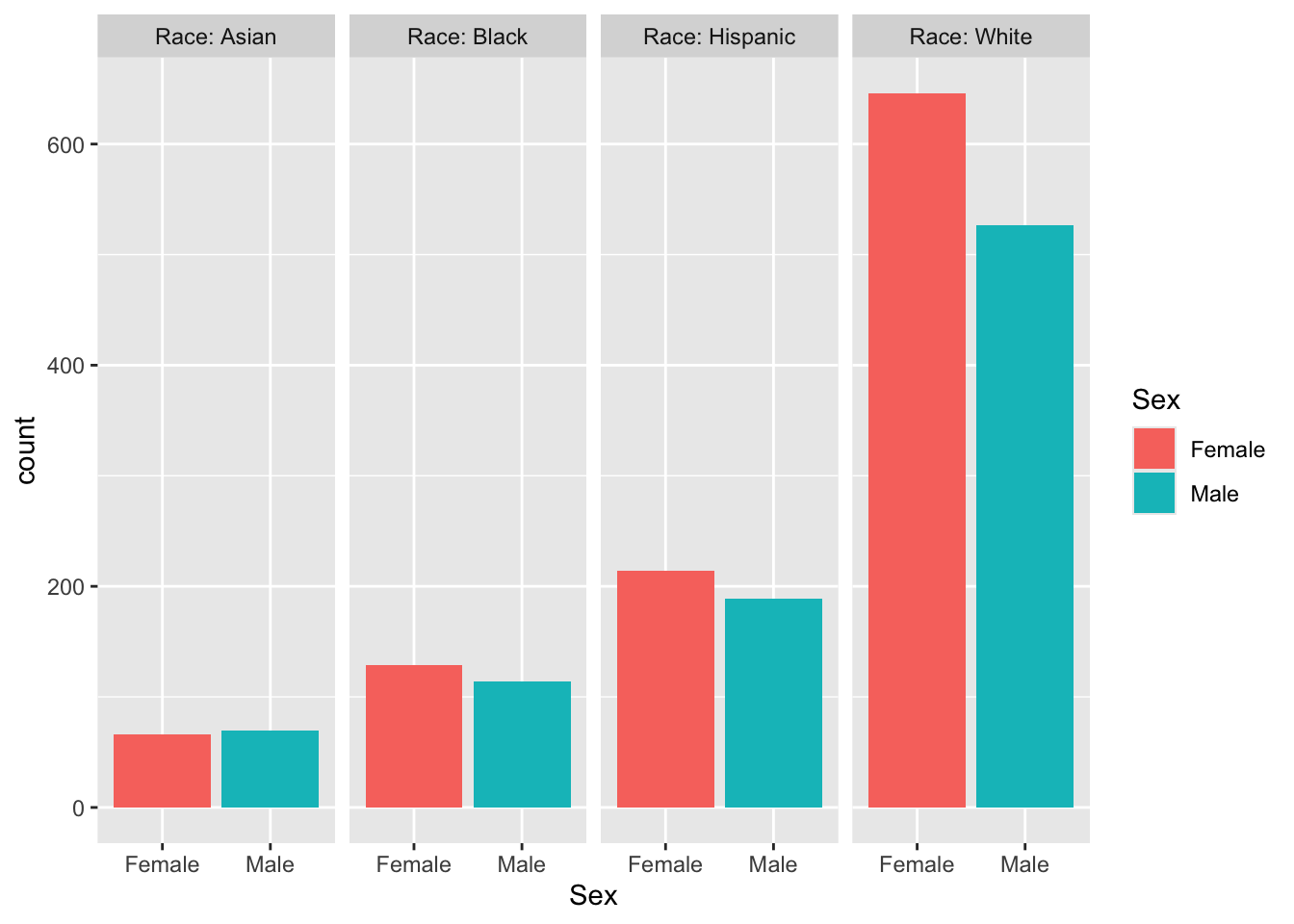
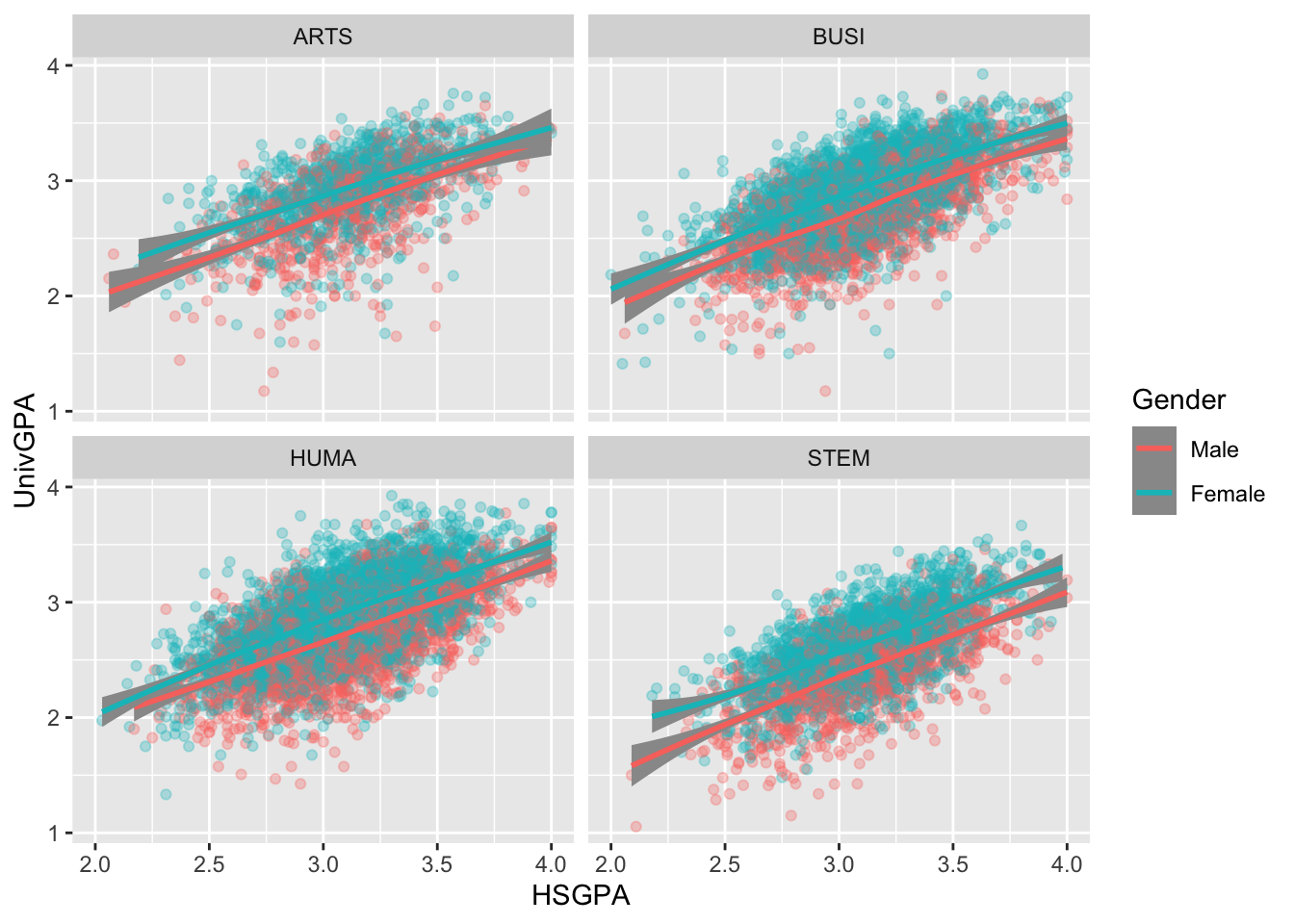
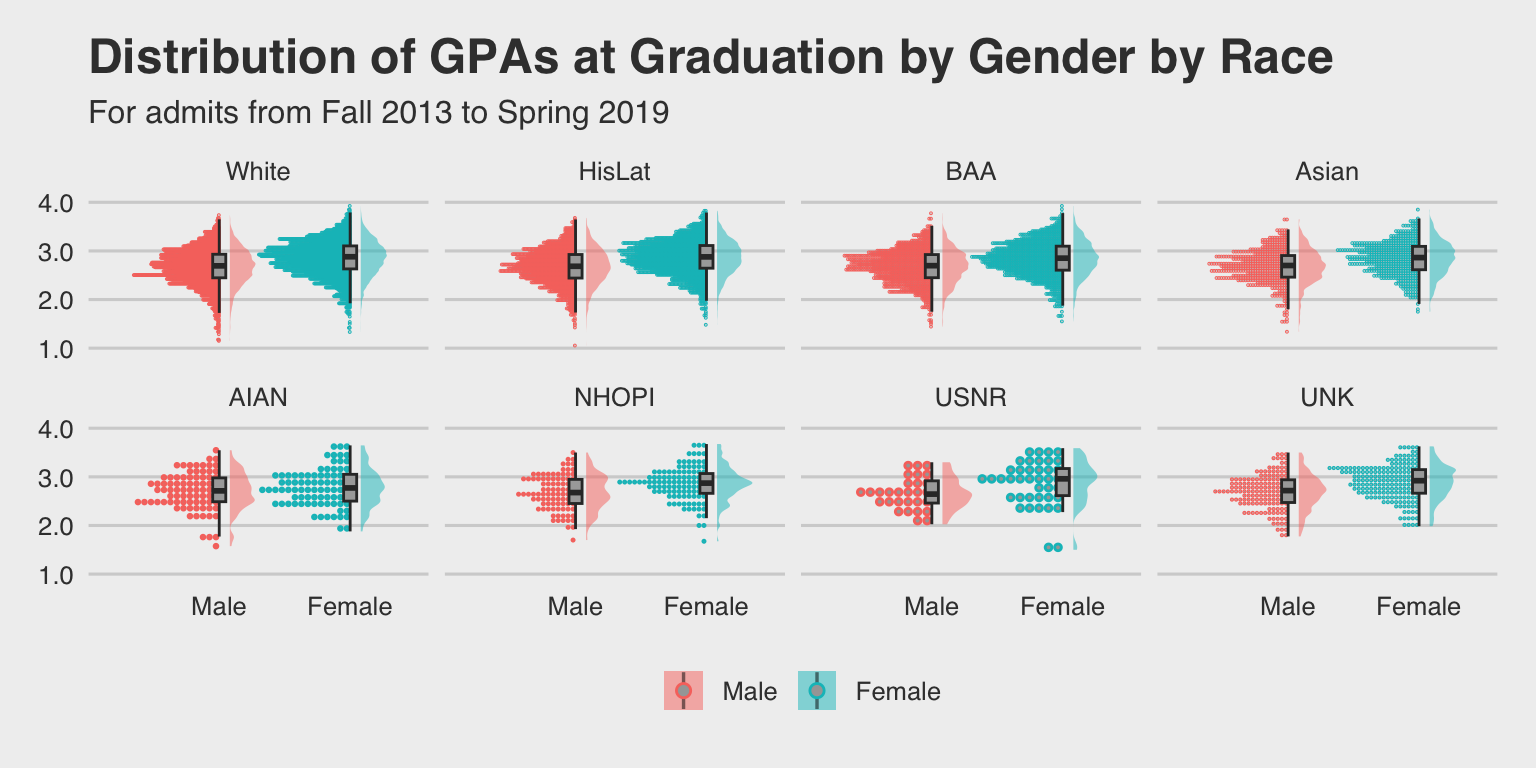
ggplot excels at creating faceted charts (multiple plots based on subsets of the data) and layering multiple data visualizations in one plot, something Excel cannot do easily.
ggplot handles larger datasets more efficiently, whereas Excel can slow down or crash with large amounts of data or complex charts.
ggplot integrates seamlessly into the broader data workflow in R (ETL, analysis, reporting), eliminating the need for separate tools or manual data exports to Excel for charting.
ggplot supports advanced customizations like custom labels, annotations, and interactions between chart components, offering far more precision than Excel.
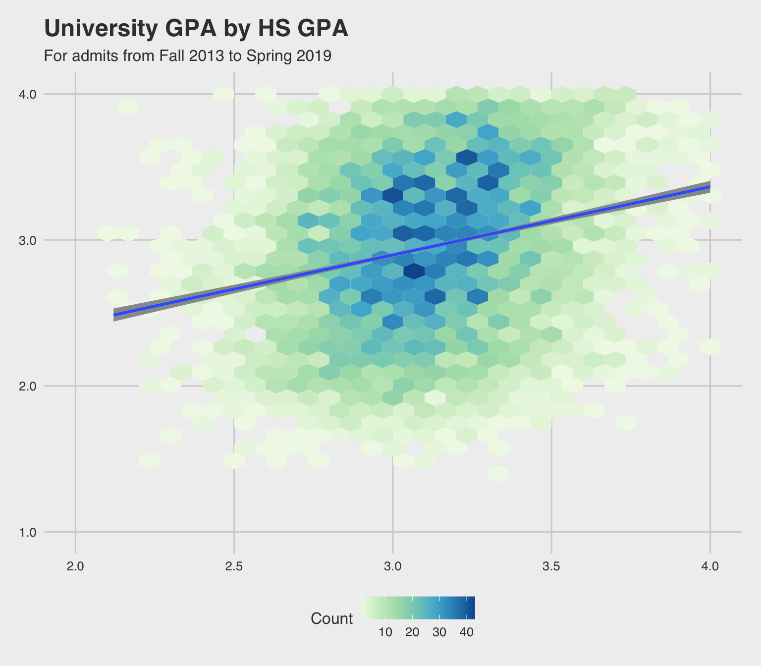
ggplot can easily handle and visualize non-linear relationships, model fits, and statistical summaries (e.g., regression lines, confidence intervals), which is far more cumbersome in Excel.
manipulate-survey.qmdsurvey |> dim()[1] 264071 16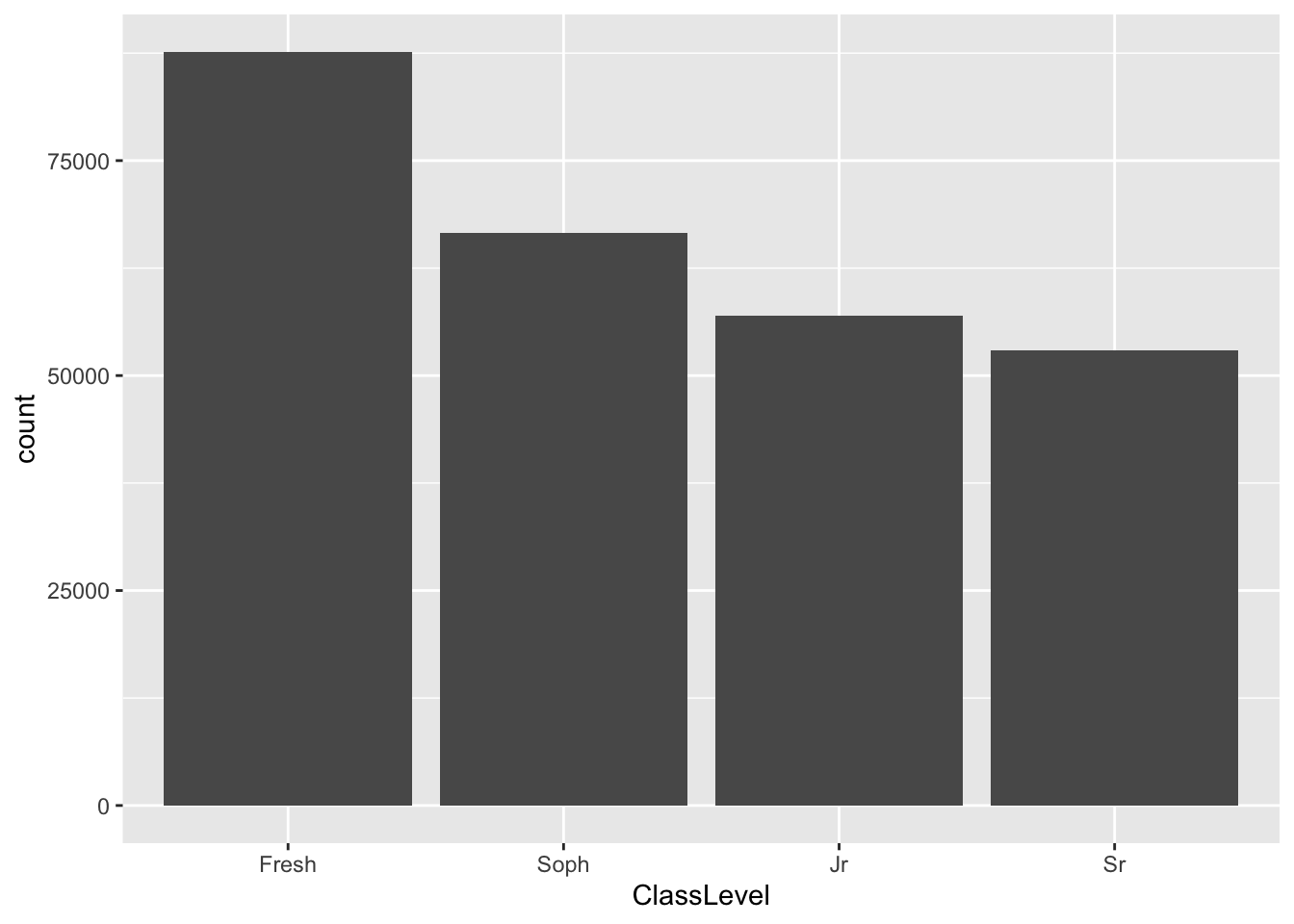
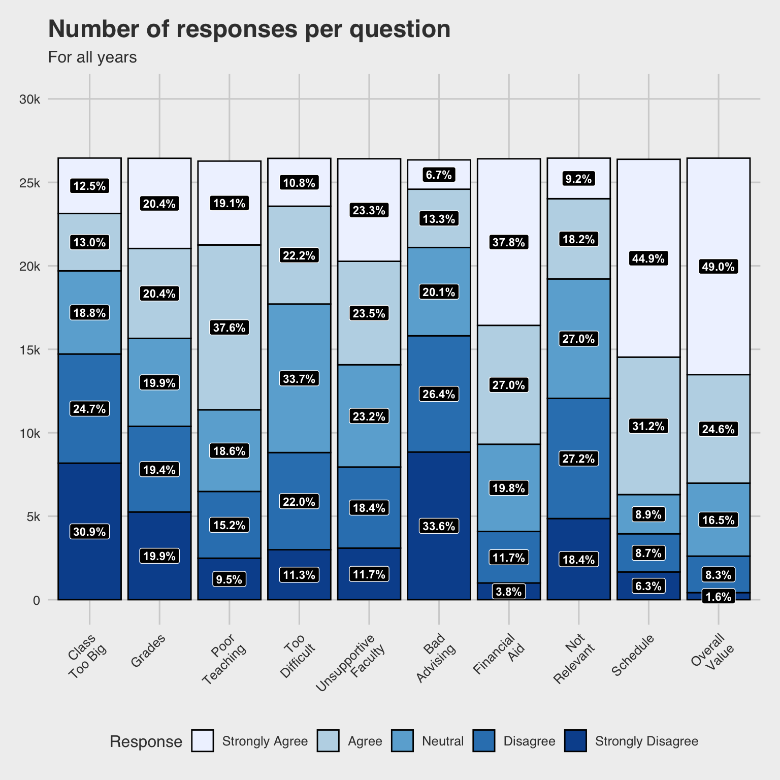
surveyQRN) the number of each Response to each QuestionsurveyQRN <-
survey |>
group_by(Question, Response) |>
summarize(Count = n()) |>
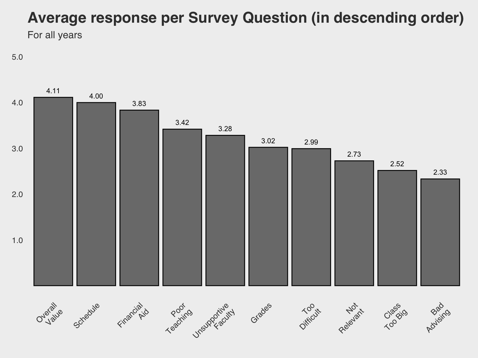
select(Question, Response, Count)surveyQAvg the average response to each question)surveyQAvg <-
survey |>
group_by(Question) |>
summarize(Avg = mean(NumResp)) |>
select(Question, Avg)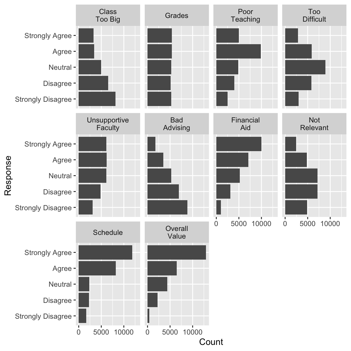
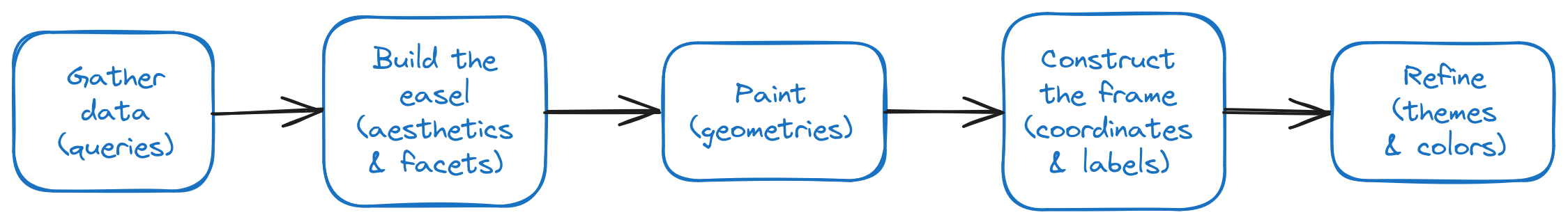
# The structure of an R/tidyverse ggplot specification
dataframename |>
ggplot(aes(X)) +
facet_Z(column-info) +
geom_Y(optional-stuff) +
labs(...) +
scale_x_continuous/discrete(...) +
scale_y_continuous/discrete(...)
theme_A() +
scale_fill/color_B(specification)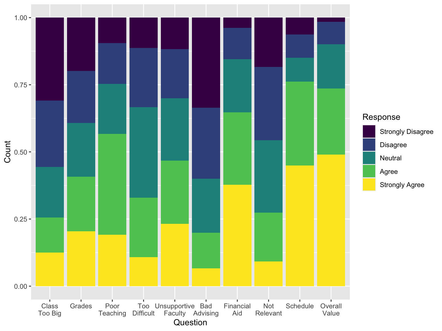
ggsave("avgresp.png")asdf
R with one report or dataset. Use it as to demonstrate time savings and improvements in quality.R, ggplot, and Quarto are open-source and free. Essentially risk-free to try.The (free) tools are out there, waiting to make your work faster, more transparent, and more impactful. Take the first step, and soon you’ll wonder how you managed without them.